The Mad Men of Security Advertising
Learn how the framing effect is used to subtly change reader perceptions in security advertising, with security strategist Tony Martin-Vegue.

We can be blind to the obvious, and we are also blind to our blindness.
― Daniel Kahneman, Thinking, Fast and Slow
There’s a famous line spoken by advertising executive Don Draper in AMC’s Mad Man: “If you don’t like what’s being said, change the conversation.”
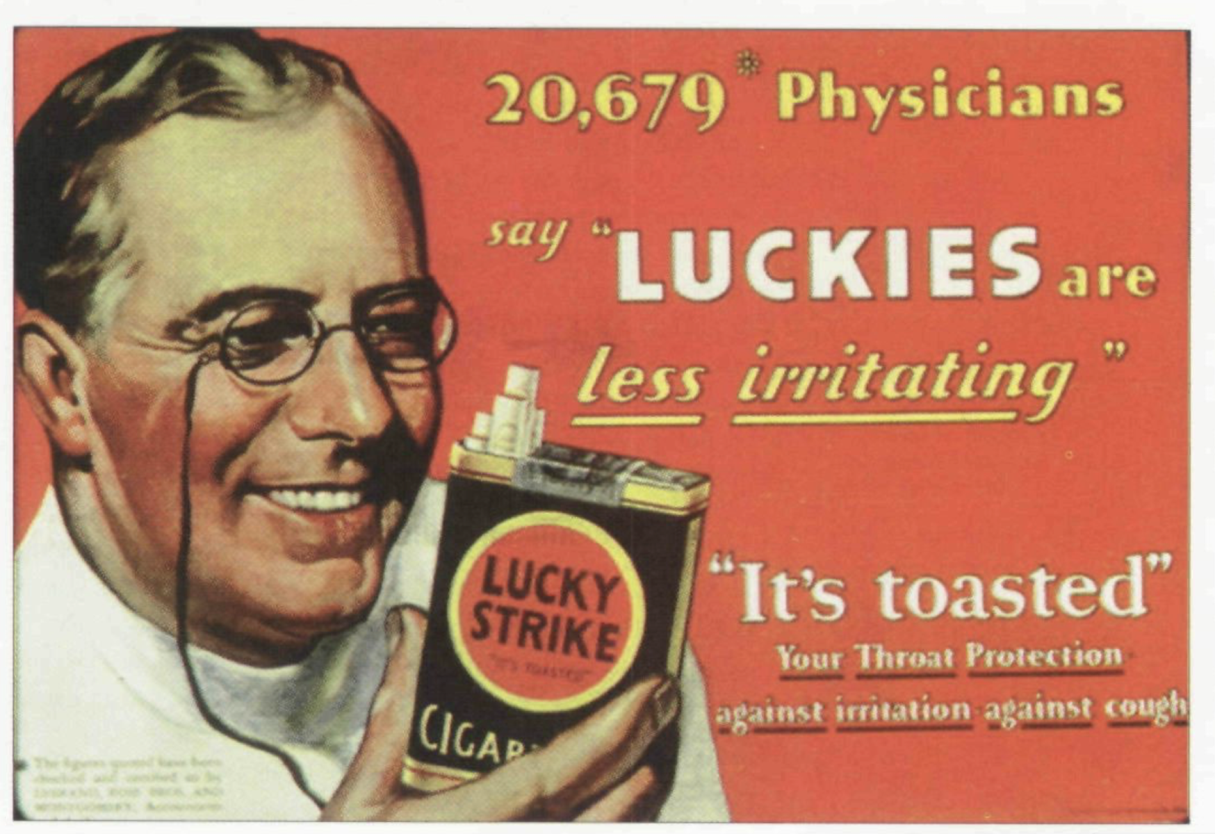
This is a loaded quote and sums up how the ad men of Madison Avenue use words, emotion, a little bit of statistics and a whole lot of creativity to change minds and sell products. Consider this example: American Tobacco, parent company of Lucky Strike Cigarettes, was one of the first companies to use physicians in cigarette ads – a trend that disturbingly lasted until 1953.

There are several psychological sleight of hand tricks, all designed to elicit positive feelings from the reader and de-emphasize any negative ones. The smiling doctor, the phrases “less irritating,” and “It’s toasted” combined with a seemingly large number of endorsing doctors are examples of what is called the framing effect. The framing effect is a cognitive bias that describes a situation in which a person’s perception about something is influenced by the way it’s presented. Who wouldn’t want something that’s both endorsed by doctors and toasted? Psychologists Daniel Kahneman and Amos Tversky explored the framing effect in great detail as they developed Prospect Theory, for which Kahneman would later win the Nobel Prize in Economics.
The framing effect is used in many places, intentionally and unintentionally, but is most present in advertising, as in the positive frame in Lucky Strike ad. It’s a very effective way to frame statistics or concepts to change the audience perception about a marketing claim. Once you’re aware of it, you’ll start to see it everywhere. Take the following Kaspersky infographic as another example of a negative frame:

Source: Kaspersky Security Bulletin 2016
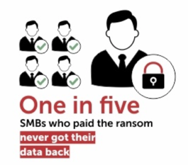
Kaspersky Lab is a Russia-based cybersecurity and anti-virus vendor. The above infographic is in reference to a study the firm conducted that shows that 1 in 5 small and medium sized business that paid a ransom in response to a ransomware infection did not get their files decrypted by the perpetrators.
There are several examples the framing effect in this infographic:
- Use of the word “never” immediately frames the perception negatively.
- Usage of the statistic “One in five” also creates a negative frame.
- Red highlighting of the phrase “never got their data back” shifts the conversation to urgency, needing immediate attention and high risk.
- The one, single victim clipart that didn’t get their files back is as big as the combined clipart of the four victims that did get their files back. The data visualization used is disproportionate to the actual data.
Just like the cigarette ad from the 1930’s, the use of graphics and data pull the reader’s perception in a very specific direction. In Kapersky’s case, the direction is very negative. The reader is left with the feeling that paying a ransom in response to ransomware infections is a very bad idea because, you may never get your files back. (…and gee whiz, I sure wish I had some anti-virus software to protect me against this terrible thing…)
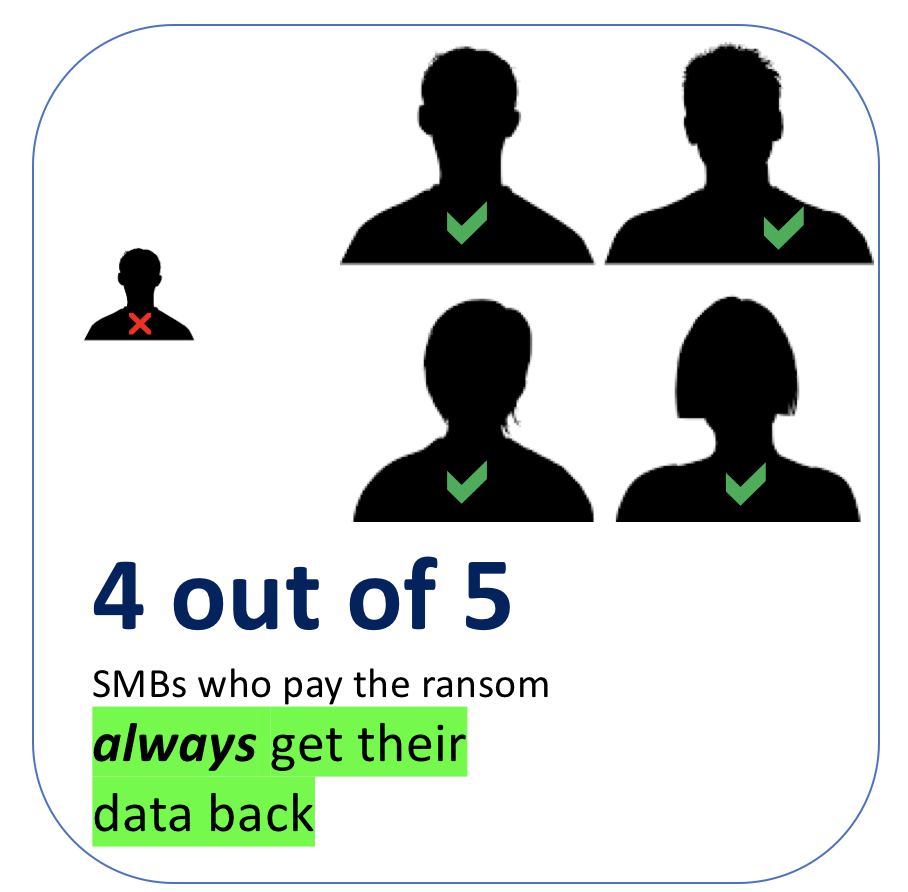
The same exact base statistic can be flipped and turned into a positive frame.

Everything about the new infographic is the same, but flipped: “4 out of 5” of something positive as opposed to “1 out of 5” of something negative; flipped clipart, positive colors and words are framed positively.
Let’s take it one step further:

80% seems quite good, and note that 80% is equivalent to 4 of out 5. The extra exclamation points are added to further reinforce the positive frame and add excitement around the statistic.
It should be no surprise to anyone that Kaspersky – a company that sells ransomware mitigation software – uses the framing effect, but they’re not the only one. It’s everywhere, and in fact, there are classes, blogs and instructional videos on how to take advantage of the framing effect specifically as a marketing tool. Overcoming these psychological tricks is not easy because they take advantage of a deep-rooted human trait: loss aversion. But awareness of these marketing tactics is a step forward in improving decision-making skills.
Tony Martin-Vegue
Main Image Credit : The awesome piece of artwork used to head this article is called 'Low Poly Don' and it was created by graphic designer Adelina Vasiliu.
This post is part of a series titled How to Lie with Statistics, Information Security Edition – visit the link to read more.

