The Semi-Attached Figure: How To Spot Manipulative Security Advertising Claims
Marketing claims and proof for the claim are often unrelated. Don’t fall for it! A guide to manipulative security advertising with Tony Martin-Vegue.

If you can't prove what you want to prove, demonstrate something else and pretend that they are the same thing. In the daze that follows the collision of statistics with the human mind, hardly anybody will notice the difference.
-Darrell Huff, How to Lie with Statistics
Out of all the ways to lie with statistics and manipulate peoples’ perceptions, the semi-attached figure may be the most prevalent. It’s hard to spot unless you are really looking for it because it’s sneaky, subtle and takes a fair bit of concentrative analysis to identify. A semi-attached figure occurs when proof is given for a claim, but when the reader looks at it closely, the proof and the claim are not related. It’s called “semi-attached” because the proof seems to support a claim, but upon inspection, it doesn't. Marketing and advertising professionals are absolute masters of the semi-attached figure.

The semi-attached figure is a hard concept to understand without tangible examples, so let’s start out with a few easy marketing claims outside of the security field.
Example 1: Now, with Retsyn!
This example was touched on by David Lavenda in a post at FastCompany. It’s such a familiar advertising campaign that went on for decades, that most of us can recite parts of it from memory. It’s also one of the best examples of the semi-attached figure.
In Certs commercials, the narrator says “Want fresh, clean breath? Get the only mint with Retsyn,” or a similar slogan. Most viewers will hear this and unconsciously accept the “…with Retsyn” phrase as proof that Certs gives someone fresh, clean breath. It sounds good – it actually sounds great! It sounds like it will make stinky breath less stinky. Here’s where the claim and the proof are semi-attached: you the audience, have bad breath and need evidence as to why you should buy Certs. Here’s the proof – Certs has Retsyn.
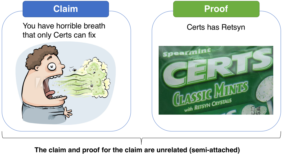
What exactly is Retsyn? According to an article by Slate, it’s “…natural flavoring, partially hydrogenated cottonseed oil, and a nutritional supplement called copper gluconate, none of which will kill bacteria.” The proof and the claim have nothing to do with each other, but it’s very effective as a marketing technique.
Example 2: These cigarettes are fine for your health
Post-World War II to the early 1970’s was the golden age of tobacco marketing in the United States before advertising restrictions were put in place. Cigarette advertising downplayed the unhealthy effects of smoking – and in many cases, made the case that it was actually healthy, and cured various maladies even though a strong statistical link between smoking and lung cancer was established in the 1940’s.
People born in the 1980’s and after have probably never seen a cigarette ad or have a vague recollection of one, perhaps forgetting or not knowing how insidiously manipulative tobacco marketing used to be. Due to the overwhelming evidence that started to build in the 1950’s that cigarettes cause serious illnesses and death, advertising had to counteract this message with pushing the "cool factor," downplaying health issues and touting benefits. To convince people to buy cigarettes, contrary to extensive evidence that they should not, marketing had to find new ways to be effective and directly play to human emotion. The semi-attached figure plays a vital role in achieving that.

This 1949 ad from Viceroy Cigarettes is a perfect application of the semi-attached figure. This came out at a time in which public health advocates started discussing the link between smoking and cancer, and this ad is an attempt to counter the message.
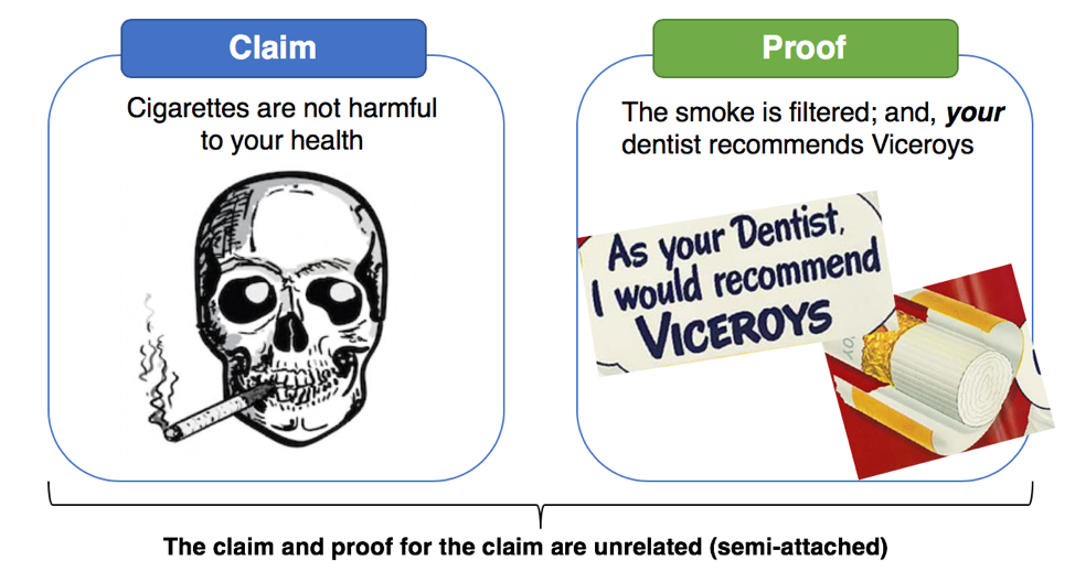
The claim here is implied: cigarettes are not harmful to your health. There are two pieces of proof provided: First, Viceroys filter the smoke. (The truth is irrelevant: research indicates filters may increase lung cancer risk). The second proof is, your dentist recommends Viceroys, with a cartoon drawing of a dentist. The problem here is obvious. The dentist isn’t real – but the reader is led to think that either this man is their dentist, or whoever really is their dentist would surely also recommend Viceroys.
Example #3: Exactly what is Unbreakable?

The Unbreakable Linux bus at the RSA conference
Starting around 2005, on the 101 freeway corridor between Palo Alto and San Francisco, Oracle advertising started to appear. It featured an armored Linux penguin mascot and the tagline “Unbreakable Linux.” The same ads showed up for years at RSA security conferences, emblazoned on the sides of busses that took trips between the Moscone convention center and area hotels. This claim refers to a product called Oracle Linux, which is based on Red Hat. Oracle has also used the word “unbreakable” to refer to other software products.
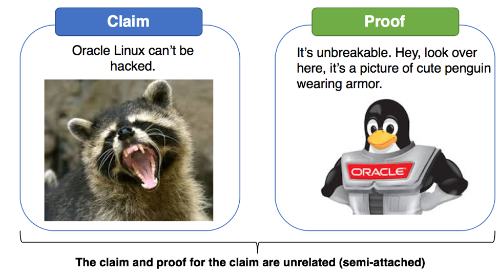
This is a classic semi-attached figure – Oracle makes a statement, “unbreakable,” and leads the reader to associate the statement with a piece of software and pretends it’s the same thing. The claim and proof are taking advantage of the perception that Linux enjoys greater stability when compared to competitors. Of course, the software isn’t “unbreakable” (no software is), and Oracle Linux has been subject to many of the same vulnerabilities all flavors of Linux has had over the years.
Unbreakable. This Linux distro that cannot be… what? Hacked? Experience downtime? Patched without rebooting? Does this refer to high availability? It’s very reminiscent of “with Retsyn.” It sounds great, but when it’s really analyzed, the reader is left thinking, what does that even mean?
Oracle still uses the term “Unbreakable,” but backtracked and admitted that it’s a marketing tagline, describing Oracle’s commitment to product security and does not refer to any specific product, feature or attribute.
Oracle is no stranger to hyperbole. This is the same company who’s marketing slogan used to be “Can’t break it. Can’t break in.”
Example #4: We won the Cyber!
100% true story; only the names have been changed to protect the guilty.
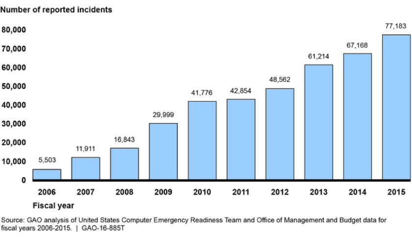
Timeshare, used car and cyber security vendor sales people all have a special place in my heart. I was in a security vendor sales pitch many years back, and the salesman projected this graph of the number of cybersecurity incidents reported by federal agencies from 2006 to 2015 on the screen. The vendor was selling next generation firewall technology.
The room fell silent to the stark reality on the chart before us as the vendor started their timeshare pitch:
“Look at this graph – from 2006 to today, cyberattacks have increased over 10-fold! We’re at war. This is proof that we’re at cyberwar and you must protect yourself. The current equipment you have cannot protect your company from these types of unrelenting, sophisticated, advanced AND persistent attacks...”
The salesman went on and on and on. I love stuff like this. I love it when vendors build their pitch around a house of cards: one tap and it all falls apart. Where’s the semi-attached figure here?
The vendor was trying to lead us to a path to believe that the sky is falling. Maybe it is, maybe it isn’t – I have plenty of reason to believe that there is some type of cyber-related doom on the horizon, but this graph has nothing to do with it. In order to find the semi-attached figure, let’s ask a few probing questions.
- It would appear that cyberattacks have increased from 2006 to 2015. Why? Are there more computers in 2015 than in 2006?
- What is the ratio of attack targets and surface versus attacks?
- Is detection of attacks better in 2015 than it was in 2006, meaning we have the ability to detect and measure a larger range of attacks?
- What is being measured here?
- What does the Federal government consider an attack?
- What do attacks against the Federal government have to do with my company (a bank, at the time)?
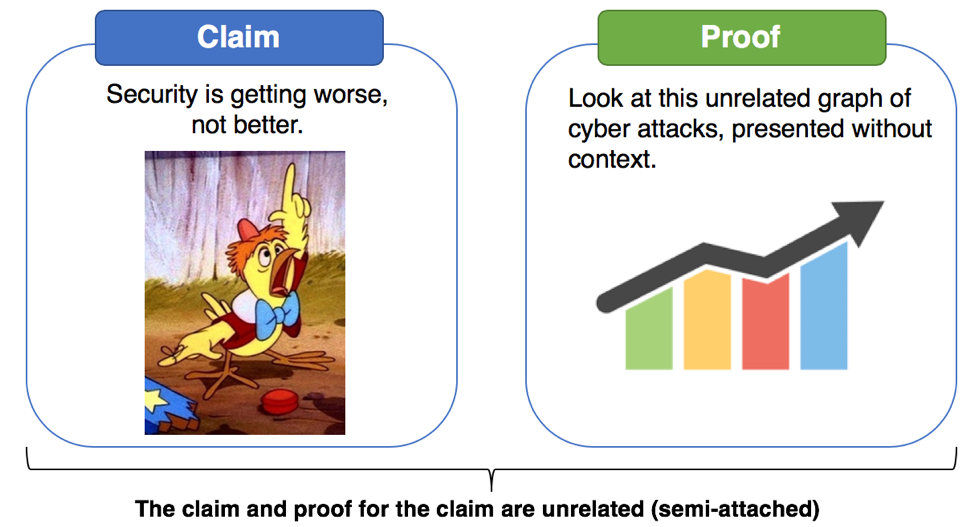
The claim is: we’re going to get hacked unless we upgrade firewalls. The proof is this graph – from a different sector, provided without context, using an unknown method of measurement.
The above graphic is from 2015. See 2016’s graph below – and I have great news! WE WON THE CYBER!
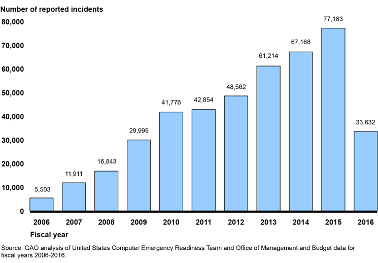
No, sorry, we didn’t. The federal government changed the definition and reporting requirements of a cyber-attack in 2016. They no longer consider a simple port scan an attack. In other words, what was being measured and the unit of measurement was changed from 2015 to 2016. Not only was the vendor pitch a semi-attached figure, the salesman was also guilty of the post hoc fallacy, also known as correlation does not imply causation.
How to Spot the Semi-Attached Figure
While using the semi-attached figured is manipulative, it’s unlikely to end any time soon. It’s far too effective. Keep in mind that the most effective marketing plays on human nature’s greatest fears and aspirations. Here are a few tips to spot and resist the lure of the semi-attached figure.
Anyone can take a number, graph, data visualization, or statistic and shoehorn it into proof for a claim. Just because something has a number or seems “sciencey” it doesn’t mean it can be automatically trusted.
Spot the claim, such has “this product makes you hacker-proof” or “Unbreakable!” What’s the supporting proof? Ask yourself: does the proof support the claim, or is it semi-attached?
Last, be especially wary of authority figures: doctors, dentists, cybersecurity experts, a CEO or past or present government officials. It could be a legitimate opinion or endorsement, but also remember that nearly everyone will say nearly anything if they get paid enough.
Here’s a challenge for readers: after you read this post, think about the semi-attached figure next time you are at the Blackhat or RSA vendor expo halls. How many do you see?
This post is part of a series titled How to Lie with Statistics, Information Security Edition – visit the link to read more.
Main Image Credit : The awesome piece of artwork used to head this article is called 'Snake Oil' and it was created by graphic designer Luke Weiss.

